Data Shape — The Most Misunderstood Pillar of Data Quality
- Tickl Ltd

- Feb 12
- 2 min read
Updated: May 12
Data Shape — Trusting Your Numbers Starts with Understanding Your Sources
When most people think about data quality, they focus on two obvious dimensions:
Is the data accurate?
Is the data complete?
But there’s a third dimension that frequently gets overlooked:
Is the data captured in the right shape?
And it’s the difference between surface-level analysis and genuine insight.
Take the following example;
Imagine you want to understand what matters most to your customers. How you capture that data completely transforms the insights you get.
Method 1 — Create a Checklist.
Give your customers a checklist and ask them to tick the features that are important.
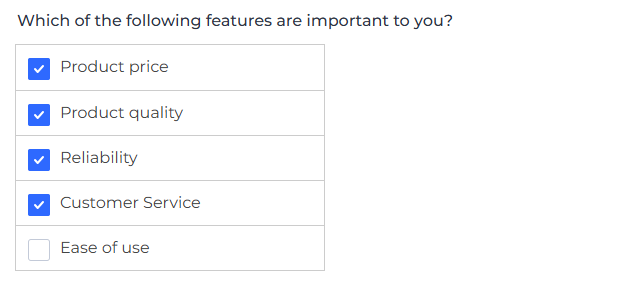
Result: You know which features are important.
Problem: You have no idea how important these features are.
Method 2 — Rank Order.
Ask your customers to rank the features from most important to least important.
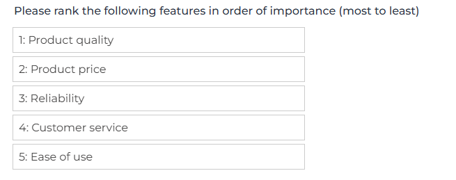
Result: You know the relative importance of the features.
Problem: You still don’t know how much more important.
“Product quality” might just edge out “Product price”, or it might be 5x more important. You have no way of knowing.
Method 3 — Token Spend.
Give your customers 100 “tokens” to spend on the features based on how important they are.

Result: You know relative importance and weight.
Now you can see that for this customer, “Product quality” is 2x as important as “Product price”.
The Same Question. Three Wildly Different Levels of Insight
How you structure your data capture ultimately shapes your understanding, and your understanding will shape every decision that follows. Looking to understand more about data quality and the shape of data? Explore our site or reach out to the team at Tickl and we'll help you build the foundations that high quality analytics thrive on.
Comments